Wind and light inspiration: to be used for a future project.

the school house
Wind and light inspiration: to be used for a future project.
Illustrators, among others, try to avoid it by using several "tools". Here's "explanation". Metaphor/Simile: You're as docile (or woolly?) as a lamb. Which one is it? Metaphor = Equate. Simile = Like or as.
Juxtapose: I hate this word, but, you know. Next to. As in I draw you next to, or place you atop of a lamb.
Visual pun: In the shape of a lamb?
Repetition: As in, many lambs accompany you.
Skew: It's odd (somehow) so you see that you're related (or differently) to a lamb.
Allusion: I lift (steal) from an image, story or idea that is known. I didn't do this to my knowledge (but have before).
Isolate: I separate colors, or shapes or textures (or other elements) so you know what I mean.
Scale change: One thing is smaller or bigger than the other. As in, I make your lamb ears so large, or your skin so hairy, you can't avoid noticing.
Compare/contrast: Things are the same, or different. As in, you're soft or woolly or, conversely, not looking like a lamb.
Paradox: A man is not a lamb, is he?
Personify: I give attributes of a human, or represent as a human, not an animal. And in that vein...
Anthropomorphism: Duh, but can extend to inanimate objects or phenomena.
Metamorphosis: As in, I turn you into a lamb.
***** But you are ONE. And are loved (extraordinarily). You, Mr. Albert Lamb.
An object, place, the weather - anything that is not a person - takes on the attributes of a human being. To personify: give abstract ideas like the weather and seasons human attributes. To anthropomorph: give human attributes to non-human entities.
In the illustration below, the tree takes on the behavior of a beau and nuzzles the lady surrounded by a grove of other, less realized tea olives.
"love in the time of tea olives," originally published for salted & styled, 2013.
The difference between a thumbnail and a sketch is that the thumbnail is bound by the orientation and proportions outlined by the project or art director.
It is a small, thumbnail size-ish drawing that tells two things: the basic composition and the basic concept of the image. A good art director will tell you, “I want three compositions for this concept,” or “I want three concepts for this scenario.” That should prompt you to draw one concept three ways, or draw three concepts one way.
This here's a thumbnail for a potential image for the 2017 book of short stories titled "The Man Who Shot Out My Eye Is Dead." by Chanelle Benz. I like one-eye stories and folks whose names end in "Z", so even though I haven't read the book, I can speculate.(Eye joke!)
Specs: The image is squarish - or so the thumbnail indicates. Someone is standing in front of a shooting range. They appear to have a shot out, or, at least, a very dark eye. He or she is holding an urn. Draw conclusions.
Facts: The flower on the urn is a stinking corpse flower! It grows the largest individual bloom in the world, larger than 3 children, and smells like a rotting body! The shape of the shot-out eye person is similar to the target silhouettes. The shot out eye and the stinking corpse flowers shapes are also similar. Alice Walker, who I used as my hair model for this piece, is a one-eyed wonder. This comparing and contrasting of shapes and relationships is also a strategy for making strong or stronger concepts (see concept vs. idea) and visual communication.
Fun things: Give the AD something to worry about so they don’t harp about your drawing skills or lackadaisical visual strategizing: Why does he/she wear a Frenchy-like striped shirt? What does that have to do with anything? What is the subject a he or a she? Are all shooting ranges found in the desert?
A sketch is a little drawing that gives the artist information for later use. It can be very detailed or very rudimentary. Either way, it's note-taking for visual story telling. One might research and sketch all the elements that might be included in the future illustration.
Antrese Wood recently invited me to speak on her podcast Savvy Painter.
You may listen to our discussion on art making, art and business and art and education below.
these "surprise gift of art to wife + moving to the philippines" art scams are so lame. you'd think the architects could be more convincing. also, they could be less repetitive and use punctuation properly! are they bots? their editorial statements are hilarious > #worthit #goodstuff #nodontsendacheck
(as delivered, after i provided a link for purchase)
So I'm trying to gather some good
stuff to make this event a surprise one. I am buying the art work of
$2,800 as a gifts to her.I'm okay with the price, I think it's worth
it
anyway, so I'll be sending a check.
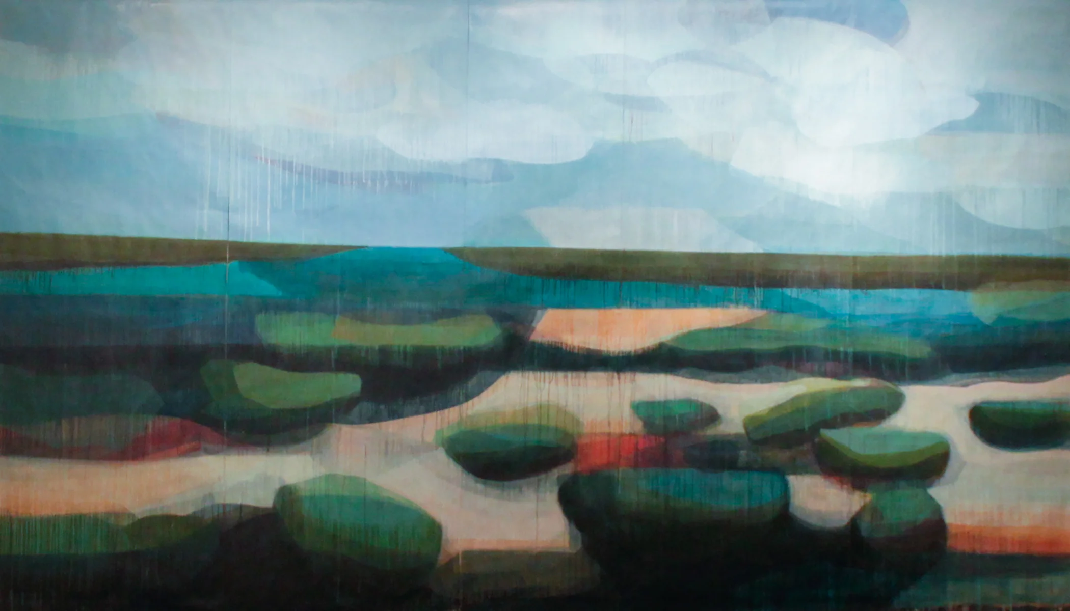
(bermuda studies) banyans, 10" x 10", water-based media on panel, 2016-2017
Dear Lester Monzon and Lester's Gallery Who Should Know Better if Lester Doesn't,
Biography suggests that one speak about one's life. That's how it works. In the field of art. We use statement, biography, resume or CV. The differences are distinct and important. I have offered a more understandable and accessible version of your "about" statement even if you have titled it "biography". And while I translate this statement-biography to poke fun at artist statements in general, I wonder if Monzon or his gallery actually means to say what he/it has said? In other words, is the statement, like the paintings, also a kind of joke, and if so, why?
Sincerely, kds
Lester Monzon, Googley, 2010 / acrylic and graphite on linen / 9 x 12 inches, courtesy Lester Monzon + Mark Moore Gallery
(original "biography")
By collapsing of architecture, space, and art history, Lester Monzon's work dissects the notion of context. Colorful gesticulations conceal sections of rigid patterning, a tete-a-tete between abstract expressionism and hard-edge abstraction that implies a gentle lampooning of the taxonomic tradition. Monzon upends the formalism and segregation innate to the fine art world, and fabricates a composite genealogy of painting - a pithy resolution to an otherwise vapid debate. Monzon's luscious brushstrokes slyly creep into a Hirst-esque field of dots or Noland-like plane of stripes, like the resurrection of a once-declared dead practice through a satirical hand. In his recent work, Monzon applies this critique of contextual art to mark-making in public spaces; be it graffiti on tiles in a public bathroom, stains on the sidewalk, or the popularized notion of "street art.
Damien Hirst. “Zirconyl Chloride,” 2008. Household gloss on canvas. 84 inches diameter. Courtesy Gagosian Gallery. © Damien Hirst/ Science Ltd, 2012. Photography Prudence Cuming Associates.
(translated "statement")
Lester Monzon makes pictures that refer to architecture, how architecture sits in space and art history. Sometimes he paints in a messy way and sometimes he paints very precisely. In Monzon’s world, both of these actions refer to traditions of abstract expression and hard-edge abstraction. With this, Monzon offers an artist’s inside joke: my paintings, in capsule, offer a system of classification for art history. He doesn’t want you to worry about what issues* arise in the art world because you can accept his quick and concise summation of art history in place of others’ uninteresting and bland solutions**.
(Skipping ahead to technique without transition) Monzon uses a lot of paint. If this paint were a person, he is a sly personality that can impersonate dots or stripes (that Monzon associates with the artist Hirst (dots) and the artist Noland (stripes)). By impersonating dots and stripes, Monzon (or this sly person who is paint) miraculously brings dots and stripes back to life because they had been dead*. You should realize that this is satire.
These days, Monzon is taking his version of funny to the streets - literally. He is painting on dirty sidewalks, on the tile in public restrooms or in some place that is called “street art” that has been made popular.
** Monzon graciously removes the viewer from a “vapid” solution to a “pithy” one
In summary, I think Mr. Monzon might engage someone to write more precisely about how and why his painting and his work merits discussion and appreciation. This statement does no service to him, his work or to the viewer. The work can be satirical and difficult to understand. The statement should not. It should additionally be an explanation and give, if not a roadmap, at least a cardinal direction toward better knowing the work and the artist.
Kenneth Noland, Via Light 1968, acrylic on canvas, 54 x 113 inches, Courtesy of Lelie Feely Fine Art
It's the most wonderful time of the year because it's camellia season. This gorgeous bloom was once called usu otome, then Frau Minna Seidel and now "Pink Perfection". I haven't quite represented it's state of pink or perfection, but I'll be thrilled to try another in time.
otome, 3 1/2 x 4 7/8, water-based media on panel, 2015 (available unframed)
Please visit my shop if you are interested in acquiring this piece or another or feel free to make an inquiry here.
The paintings of Paul Kremer and Les Rogers dare you, "C'mere! Come here!" They say, "Hey, girl! Wanna listen to some music, hear some poetry, let the sun beat down on your head, shake your hair, your haunches? Care to think about heartbeats, the power of color and shape-making, mind and space shifting in a secret, through-all-the-ages-and-time-but-it's-ON-now language?"
Not so fast, sister. The award for excellence in transforming live, genuinely engaged human beings (who can be plied with greetings, information and the promise of owning the most-best painting-makings currently exhibiting) into cold, lifeless stone forever goes to Peter Makebish. His craft in curating a vibe, turning up the music, creating poetry and dashing hopes and hearts is so honed and precise, I named this award after him.
Congrats, mon frère Pierre.
katherine sandoz portrait of peter makebish at untitled art fair, miami, florida, december 2015
Old program - giving out awards - new name: Sandoz Art Awards. Like the Swiss Art Awards, I have 11 awards (or more) to bestow. While I don't offer winners 25,000 CHF and an artist residency in Mexico (!), the gallery, person or piece of art does have a portrait or drawing made in homage to the achievement.
artist denise duong photographed by katherine sandoz, oklahoma city, june 2015
This year, for those deserving, I'm recommending paintings - always. I'm also suggesting works on paper as they are often a very unique and unusual offering of the artist's process and presentation. They travel light, safely and cheaply. Last, cost of this work tends to come in slightly lower than those on more substantial substrates.
I have a number of smaller works on paper available on SANDOZIA. You may consider some mid to large scale works through the Spalding Nix Fine Art shop on 1st dibs. I also have some very large works (8 feet plus) at the studio. If you wish to inquire about these, please call or email me.
For the naughty set: coal. It's a traditional and classic way to communicate the required message. For 2015, artist made stockings in paper, fabric or upcycled materials are de rigueur. Maybe you are just the artist?
(color fields) water's edge, 8' x 12', water-based media on paper, 2015
Will it be hierarchical or all-over viewing? Will it be "pretty" or "ugly"? In the meantime, I highly recommend this type of passing work back and forth. This is one of the fastest learning methods I've encountered.
A selection of my paintings travel to the Houston Fine Art Fair courtesy of Spalding Nix Fine Art, September 9-12.
Painting session 2, time-lapse 1 on a triptych with artist Troy Wandzel.
Stitch-n-fish? File these puns under "same old jokes." What's not punny or funny; the privilege of sitting with the boys while they fish, Lego, analyze the world (and bicker) while the tide and the season shift.
fiber arts on vernon river
WIP: work in progress
This image is one of hundreds captured on timelapse. Savannah-based artist Troy Wandzel and I are currently collaborating on a triptych. You may see Troy's timelapse is his first session here. When we end work on these panels we hope to splice all the timelapseS of the painting sessions together.
katherine sandoz, session 2, sandoz|wandzel collab summer-fall 2015
Seeing cacti everywhere. And making a series of squares featuring cactus with remnants from the 612x912 artist residency at SixTwelve in Oklahoma City. I saw a ton of cactus there. One ton!
On the subject, that seems to be the theme for this summer, here's a great quote from dancer Katherine Dunham:
“A creative person has to create. It doesn’t really matter what you create. If such a dancer wanted to go out and build the cactus gardens where he could, in Mexico, let him do that, but something that is creative has to go on.”
That's it, people! Something has got to go on!
Sometimes called Cow Lily, you can find spatterdock all over the southeast. You'll know it by the heart shaped leaf and a yellow flower that looks more like a tuber than a bloom.
spatterdock, 36" x 26, water-based media on felt paper, 2015
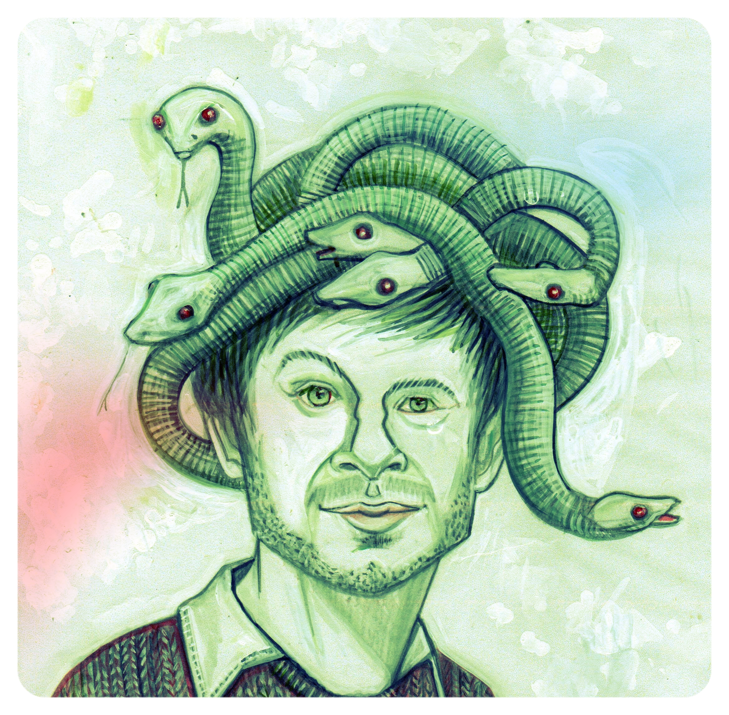
The playwright and author shot in the studio at the 612 x 912 residency at SixTwelve in Oklahoma City.
adam davies, june 2015